Where the Buttons Go
I kept rebuilding custom dashboards for my training data, and the delay led me to a scale: some buttons must never move, some views should be generated per question, and some interfaces should disappear into agent work.
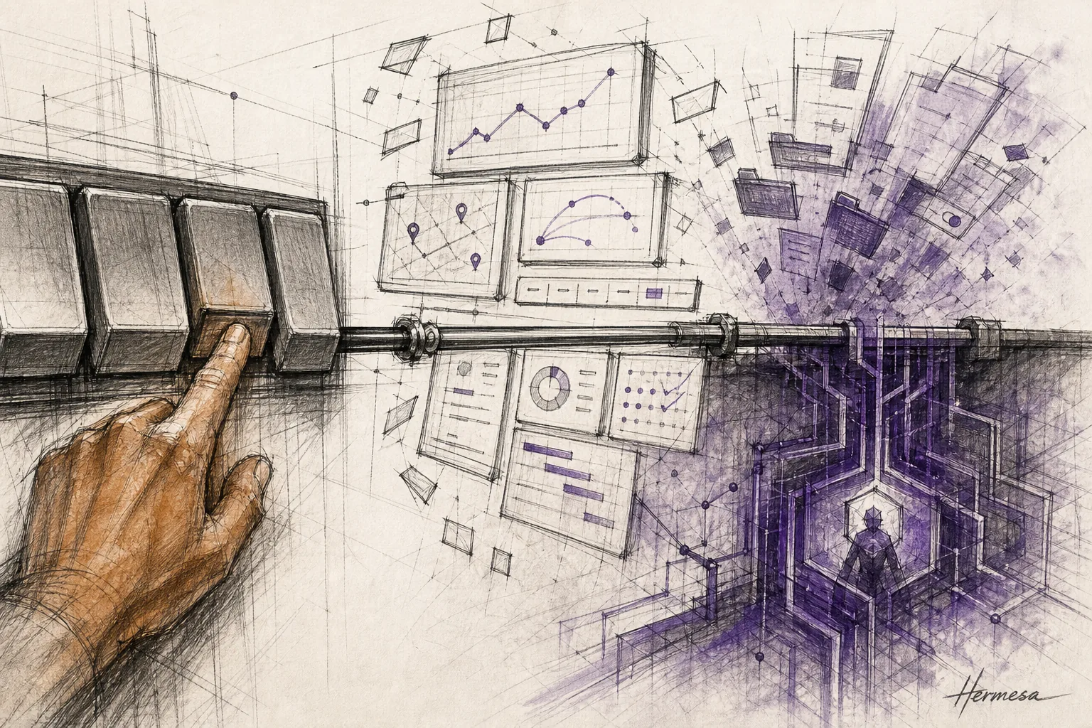
Every few weeks I rebuild the dashboard I use to review my training. The data is already there — journal entries in my Obsidian vault that my Hermes agent populates for me — but the view never survives. One week I want volume plotted against sleep. The next I want to know whether my squat stalls when work gets loud. Each question wants its own screen, and no pre-built fitness app has ever guessed the question right.
I love having those dashboards. I hate the wait. Building one is never instant: there’s always a delay between asking the question and seeing the view. And that delay is what got me thinking: if a custom view per question is this good, is generative UI viable everywhere?
A quick disclaimer: I’m not a professional designer. Nothing below is design theory. It’s a set of patterns I kept noticing while trying to answer a different question — what businesses will look like in five years — and finding that every path led back to interfaces.
Here’s the first pattern. The industry has been asking a version of my question for years, and the market keeps answering no with money attached. Humane raised hundreds of millions to replace screens and became a cautionary tale. Rabbit ran the same arc faster. Voice assistants were sold as the future of computing and settled in as kitchen timers. Microsoft put a Copilot key on the keyboard, which tells you more about Microsoft’s hopes than about anyone’s habits — nobody ever needed a Gmail key, and Gmail did fine.
The failures share a shape: they attacked tasks buttons had already won. Order a coffee through an agent and you’ll describe your drink, confirm the store, approve the payment, and wait — losing a race against three taps you could do half-asleep. The most capable computing systems ever built keep losing to a grid of icons, and the reason is worth taking seriously.
The reason is your hands.
Think about an instrument. A piano never rearranges its keys. A guitar’s frets don’t move to be more discoverable. That permanence is not a limitation — it’s the entire deal. You pay upfront, in practice, and what you buy is the right to stop looking. The interface disappears into your fingers, and from then on you spend zero thought on where and all of it on what. Musicians call it muscle memory. Designers call it consistency. Either way, some buttons earn the right to never move again, and any “smarter” interface that moves them is stealing something you already paid for.
That’s one end of the scale. The other end has no buttons at all.
Some work was never worth a screen. Renaming files, chasing receipts, reconciling folders, clicking through a professional tool’s forty menus to find the one export setting: interfaces for this work were always a tax, and agents are simply refusing to pay it. I feel the shift in my own workflow: when a tool won’t expose itself to my agent, I’m annoyed at the tool, not the agent. And companies are conceding the point in public. Salesforce shipped a headless version of itself this spring. Benioff’s pitch, verbatim: “No browser required. Our API is the UI.” Notion and Google ship tooling so agents can skip the screens their teams spent a decade polishing. Linear reworked its product around agent workflows. You don’t do that unless your users are already leaving through the side door.
So the picture I ended up with is a slider. Simple actions on the left, complex actions on the right. On the far left live the toggle, the play button, the music app — interfaces you press without looking, because looking would slow you down. On the far right, the terminal and the agent — work you describe instead of click, the complex workflows something like Claude Code carries for you. My first model was two zones: freeze the left end, hand the right end to agents. Tidy. And wrong — or at least badly incomplete.
Because almost everything I actually do in a day sits in between. Planning a trip. Reviewing feedback. Comparing options. Looking at my training data from an angle nobody predicted. Not habitual enough to be piano keys. Too visual, too mine, to hand to an agent and read a paragraph back.
This middle is where I found the second pattern, the one I can’t unsee: every task has a design threshold — a minimum amount of purpose-built interface below which the work hurts. Chat sits below the threshold for most of it. Airbnb — the company with maybe the strongest incentive to nail this — looked at chat booking and passed; Chesky, flat out: “I do not think a chatbot is the right interface for travel or e-commerce.” A wall of text is a downgrade from a map with pins. But the pre-built app overshoots in the other direction. Google Flights is superb for round trips; ask it for two travelers from two countries converging on San Francisco with a flexible stop in New York, and the grid simply has no shape for the answer. The prompt box up front may be AI. The grid behind it is still 2015.
What clears the threshold is the thing I’ve been hand-building for my workouts all along: a view constructed for this one question, used, and thrown away. A disposable dashboard. The only problem with mine is that I’m the one who has to build them — and that’s precisely the part about to stop being true. The same systems that write code from a sentence can assemble an interface from a question, on the spot, out of components a designer approved. Not a designed screen. A designed system that emits screens.
From what I’ve watched so far, this arrives in three levels.
Level one is already here: generated components inside an existing product. Ask a model to explain a concept and it can hand back an interactive visualization instead of a wall of text. Google now generates whole layouts and small apps inside Search and Gemini. Today these interfaces take their time assembling. Web pages took their time once too, and nobody remembers loading bars as the reason the web failed.
Level two keeps the familiar product but lets parts of it adapt to the query. The flight search that meets my two-countries-one-flexible-stop trip with a view invented for it — a date slider, grouped routes, prices colored across regions — instead of a grid with no shape for the answer. Nobody at Google hand-designs that screen. Designers ship the components, the visual language, and the rules; the system assembles the rest. That’s the direction Chesky is betting with his new AI lab — models built for rich interfaces, explicitly not chatbots.
Level three is when the rules become the whole product. No fixed app with generated corners — a component kit, a visual language, and a policy for what appears when. The designer’s deliverable stops being screens and becomes the system that decides. I haven’t seen a level three I’d use daily yet. I don’t expect that to stay true for long.
The obvious objection is the strongest one: doesn’t generated UI break exactly the muscle memory I just spent four paragraphs defending? If my banking app invents a new layout every morning, that’s not the future, that’s a usability crime.
Yes. Which is why this is a scale and not a replacement. Generation belongs only where no habit exists — the one-off question, the query no designer could have anticipated. The moment a generated view turns out to be needed twice a day, it should freeze into buttons and start earning muscle memory like everything else. The slider has a direction of flow: novel views get generated, useful ones calcify, tedious ones dissolve into agent work. A product is healthy when things keep moving along it.
The third pattern is the one I didn’t expect, because it isn’t about design at all. Once the scale clicked, I started seeing the same three-way choice in engineering work, just under different names. Automating anything, the real question is where it sits on the slider. A task identical on every run wants a CLI: flags frozen in place, the piano keys of tooling, muscle memory for scripts and agents alike. A task with a stable shape but varying content wants a workflow: deterministic steps around flexible middles. A task that’s genuinely open-ended wants an agent with skills. And the flow direction holds here too: when my agent improvises the same procedure three times, it gets extracted into a skill; when the skill stops changing, it deserves to freeze into a command. Tooling calcifies along the same slider interfaces do.
Which finally answers the five-year question I started with. The businesses I expect to win won’t be the ones with the best-looking screens, because screens stop being the thing a company ships. What it ships is the placement decision — which parts are frozen, which are generated per question, which have quietly become invisible agent work — plus the component kit and the rules that keep the generated parts on-brand and sane. Their engineering teams will be making the same placement call about their own tooling, one script at a time. Design doesn’t shrink in that world. It moves up a level: fewer mockups, more constitution-writing.
I’ll still be rebuilding my training dashboard next month. But some month after that, I expect to just ask the question and watch the right view assemble itself — fast enough that the question is still warm when the answer arrives.
The dashboard was never the point. The training is.